Indigo: A Well Designed Social Media App For Those Who Need It

Good design and execution matter.

Here’s something I’ve been recently thinking about software. There’s really nothing new under the sun. And the skies have been cloudy for a good while. It feels like we’ve reached a point where the only difference between apps within a category boil down to execution and design. Often not even then.

Screenshot of new social media app Indigo

Perhaps we’ve exhausted all of the ideas for what software can do and we’re just looking for a better iteration of what we already have at hand.

I’m talking on a consumer level. Beyond whatever AI supposedly offers, and the explosion of social media apps that happened when Twitter x-ed itself out, I can’t name an app or piece of software in the last few years that wasn’t a different version of something that already existed. Even AI software feels like it’s more of the same, just at a quicker pace.

Certainly there are nuances. But over time they tend to blur. As an example, take weather apps. They’ve all recently followed the leader (I don’t know which app that was) to display variable forecasts from different weather sources. It’s a good feature given that weather services can offer different forecasts. But as most weather apps have quickly adopted similar features, once again there isn’t much of a differentiator between them. Unless Carrot Weather’s bell weather use of insults is your cup of tea.

Don’t get me wrong. Execution and design can (and should) go a long way. Even more so when all things seem much the same or serve the same purpose. Beyond price, that’s really the only big differentiator.

It’s why I’ll try out an app that looks like it doesn’t offer anything beyond what I already have. Within that personal scope, let me say that the new social media browsing and crossposting app Indigo is worth your attention if its functionality fits how you use social media.

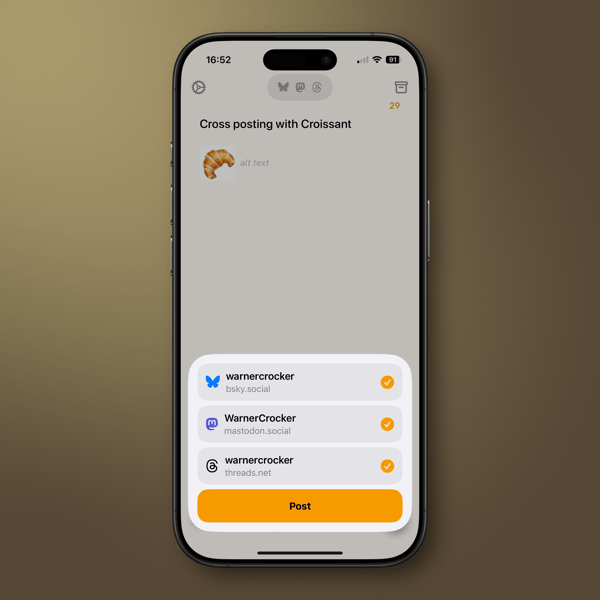
Indigo is the creation of Soapbox, the developers who created crossposting app Croissant. (I wrote about it when it released.) While Croissant allows you to cross post to Mastodon, Bluesky, and Threads, (functionality I find useful), Indigo is meant primarily to merge and scroll through a single timeline of your Mastodon and Bluesky feeds. You can also crosspost to both if that’s your desire. Threads isn’t included, as it doesn’t allow for viewing its timelines in the same way, which is curious as it is supposedly federated with Activity Pub.

If scrolling social media feeds is your thing, Indigo is certainly worth a look. It’s very well designed, and easy to discover its functionality.

It’s a first version of the app, and as one of the developers, Aaron Vegh says on his blog, “The Indigo we’re shipping today is going to be the worst version.” For the worst and first version, I believe Aaron and Ben McCarthy have done an excellent job. (You should read both Aaron’s and Ben’s blog posts. Ben’s describes the functionality quite well.) Having followed the development of Croissant since its release, I’ll say that the care they’ve used in the past with that app points to the same for the future of Indigo.

If you use both Mastodon and Bluesky, once you sign in to both through Indigo, you see your feeds merged together. You don’t need to use both social networks. The functionality is the same if you prefer only one of the two social networks. So, if you’re user of only one, it could replace whatever app you might currently be using.

One of the nicest design touches, and obviously an essential one, is that it’s easy to distinguish where things are coming from if you merge your timelines. Mastodon links are purple and those from Bluesky are, well they’re blue.

You can tell if a post is crossposted between the two networks, and another nice feature is that Indigo will merge the two in some cases (timing plays a part) so you don’t see them twice. You can switch between each version and take actions like quoting or replying to both at the same time.

If you’ve used Croissant to crosspost, doing so on Indigo will feel very familiar. Notifications, should you choose to receive them on your device, work as you would expect. The Notification tab in the app is quite well done and easy to understand.

The app is available for the iPhone, iPad, and Mac, and a single subscription covers you across devices. There is a free tier that’s read-only. If you’re interested in Indigo, the free tier is read only. That’s good way to determine if the excellent design of the app appeals to you.

If you use both social networks and would like to combine your feeds into one timeline I think Indigo is worth a look. Let me say this about Indigo and my social media usage. The single merged timeline feature has its attraction, but it’s not something that’s a high priority for me and that brings me back to the beginning of this post.

I like to keep my eye out for developers who focus on good design and good functionality. That’s the case with Indigo. As in this case, an app may not fit my needs, but I’ll remember the developers or company behind it. It’s much the same way I follow good theatre or film directors, and good writers.

I don’t see many new ideas or new needs to fill coming down the software or app pike in the near future. That may say more about me than it does the software market these days. Even so, that view of mine has me paying even closer attention to those who care about the look and feel of what they produce.

(image from the author)

You can also find more of my writings on a variety of topics on Medium at this link, including in the publications Ellemeno and Rome. I can also be found on social media under my name as above. This site does not use affilate links. 


Looks Like Thaw Will Be A Good Menu Bar Manager Solution For Mac OS 26

Melting the Ice

I use a lot of Menu Bar apps on my Macs. It looks like I may have found a new solution to managing those apps.

CleanShot 2026-04-03 at 17.10.

I had previously used Bartender to manage those, especially on the MacBook Air with a notch. But since the release of macOS 26, Bartender had run into some difficulties. I gave macOS 26’s new way of handling Menu Bar items a try, and that just didn’t work for me. I experimented with a few other Menu Bar managers and for a while settled on Ice.

Like Bartender, Ice also had its issues, and its developer has since halted updates. Turns out there’s an app that melts those issues away. It’s called Thaw.

Thaw, created by stonerl, is an open source fork of Ice, so much of what it offers is familiar and you can import your Ice settings. This article by Jannis explains why Ice, and I presume Bartender, ran into difficulties managing Menu Bar items.

So far things are working as expected. The idea is to hide Menu Bar icons that I don’t access frequently, yet make them available with a quick cursor flick to the Menu Bar.

As a side note on this, with the debut of macOS 26, it appeared Apple made was beginning to shift users away from using Menu Bar apps, favoring the Control Panel instead. I could easily get on board with that shift, but very few apps I use actually make Control Panel access available without creating a Shortcut to launch the app. That seems like a waste of time, but perhaps more apps will make accessing them through the Control Panel possible when we move to macOS 27.

You can also find more of my writings on a variety of topics on Medium at this link, including in the publications Ellemeno and Rome. I can also be found on social media under my name as above.


AntiFreeze: A Web Based Solution To Track ICE

Life and the web finds a way

Remember ICEBlock? The app created for iPhone users to track and alert others of ICE activities nearby? You know the one that Apple and Google blocked. There were several others that got blocked as well.

In this moment of something new and horrible to distract attention from the latest happening almost every hour, ICE activities might have faded from the headlines, but those activities haven’t ceased.

joshuahacks has created a progressive web app called AntiFreeze. From his post on Daily Kos:

AntiFreeze lets anyone anonymously report an ICE sighting. When someone submits a report, every user within five miles gets a push notification on their phone in real time. If ICE is spotted four blocks from your house while you’re making dinner, your phone buzzes and tells you.

But it’s not just alerts… Open the app and you can see a map or list of every reported sighting within 25 miles from the last 72 hours. So even if you missed a notification, you can check what’s been happening in your area before you head to work, drop your kids off at school, or go to the grocery store.

No login. No account. No personal data collected. Completely anonymous.

You can read all about it and find out how to use it on that post. As the developer and author says, “It works. It’s free. And nobdy can take it away from you.”

Who’d a thunk that the web could be the answer?

(images are from screenshots of The AntiFreeze app and website

You can also find more of my writings on a variety of topics on Medium at this link, including in the publications Ellemeno and Rome. I can also be found on social media under my name as above.


The Power Users Have With Subscriptions

Unsubscribing is a vote

I was not a fan of app subscriptions initially. I long ago rethought my position. I continue to think it’s the best option for users. That belief is becoming more entrenched now that we’re entering into whatever the future will be with Artificial Intelligence and it takes constant cash to continue to burn the planet.

Apple Creator Studio hero_571x321.jpg.large.

Whether it’s this week’s flavor of AI chatbots, Apple’s new Creator Studio, or any other new app or service, most now require a subscription to take advantage of new features as they roll out. In most cases the offer is pay $XX a month or $XX a year, with the yearly price being discounted by the cost of a month or more. Even so, we’re already seeing premium subscriptions that add on costs for more features and I think that trend will only accelerate. Welcome to the land of upsell.

Although much less than I used to, I will subscribe to a new app or service that attracts my interest for a month to check it out. I’ll set a reminder a few days before the end of the month and then take a little inventory to see if it’s worth continuing. If not, I’ll unsubscribe.

If the app or service is truly worth my while I may subscribe for the yearly price after determining it’s something I value, but that’s becoming rarer. Frankly, there just aren’t many new apps and services that seem worth even a monthly try out these days, much less paying for a yearly subscription. There have been a few apps that, although they didn’t really fit my needs, I have paid for a yearly subscription to support the developer. But that’s even rarer.

In those cases with apps, newsletters and other services, I think of those more as tips or a donation than I do entering into an ongoing relationship. I’ve even subscribed on occasion and immediately canceled with just that thought in mind. I’m all for supporting good work by good people. I admit it’s a bit unfair to a good app that doesn’t fit my needs, but it’s still a signal that I think is worth sending.

Here’s the key. Large companies (Apple, Microsoft, Google, etc…) and independent developers, writers, etc, notice when the turnstile rotates in reverse because someone unsubscribes. It’s a metric they pay attention to. They count on inertia and waning attention spans. You might think they don’t notice, but they do. As a user I look at unsubscribing as my vote up or down. Again, maybe unfair, but as I said, it’s a signal worth sending.

With the recent release of Apple’s Creator Studio suite of apps I found it remarkable that much of the commentary included mentions that users could try things out and turn off the subscription payments if they didn’t find things suitable for their purposes. Or, if they needed one of the apps for a short project that they could check in and out of the bundle for the duration of the project. I highly recommend that kind of thinking.

For what it’s worth I chose not to subscribe and try out the new Creator Studio. I thought about it, but have long since discovered other tools that fit what I might need from those apps.

In this hyper political age, we talk a lot about voting. That’s always a choice. Using the choice to subscribe and unsubscribe from apps and services can be one as well.

You can also find more of my writings on a variety of topics on Medium at this link, including in the publications Ellemeno and Rome. I can also be found on social media under my name as above.


OS 26 First Impressions

Early thoughts on OS 26 versions

Bubbles. My grandkids love bubbles. It’s a kid’s delight. Apparently bubbles also delight some Apple designers. My first impression of the look of iOS 26 on the iPhone was bubbles.

PXL 20250916 124836790.

I watched the OS 26 round of operating system betas over the summer as things evolved and have now installed the first release on all my devices. I’ve seen and heard the reactions so I was reasonably prepared for what would happen once the updates occurred. These are some first impressions after taking a look.

Liquid Glass

I’m not putting down bubbles. Bubbles are fun, whimsical, and joyful. But my overwhelming impression on the iPhone 16 Pro with iOS 26 installed was that the Liquid Glass design language, (that supposedly isn’t a design language,) felt very bubbly and child-like. To my eye I associate it more with bubbles than I do glass, liquid or not.

I also thinks Liquid Glass looks and feels better on the iPad Pro than it does on the iPhone. There’s more space for the chunkier, bubblier UI elements to float around. By and large things look cleaner on the iPad.

On the Mac, Apple didn’t go quite as far with Liquid Glass as they did with the iPhone and iPad regarding transparency and bubbly things, but there is still a more cartoonish feel to macOS 26 than the previous version. I think most of that is due to the rounded corners, rounded buttons and tab bars. I will say in this early going, I miss what I felt was a cleaner design in Sequoia on the Mac than what I see in this early going with Tahoe.

Bubbles are also messy things. Messier than glass in solid form certainly. Perhaps applying liquid properties to this glass like interface provides a license to keep things messier. That’s certainly true in some cases on the iPhone. For example, in the Phone app the reflective (or is it refractive) qualities around the buttons make it feel like light is leaking through a misapplied sticker than I think was the intent.

New Shareshot.

On both the iPad and the iPhone you’ll have to be careful what you choose for a wallpaper, because that same light leaking through means photos that have many colors or light contrasts within them appear more distracting than pleasing. (I like to use my own photography for wallpapers).

New Shareshot.

The issues of legibility have been discussed quite a bit over the summer, and I don’t think Apple has a complete solution for that yet when it comes to complex backgrounds, other than seemingly to force users to make simpler choices with wallpaper backgrounds. In early use, I think what we see on iPhone and iPad completely renders useless the statement of letting your content shine through. It might bleed through, but if it shines it does so in a distracting manner.

Here’s an example of one of my Home Screens that I think makes things look more bubbly than Liquid Glassy, especially in the upper two rows of folder icons.

New Shareshot.

Alan Dye, the VP of Human Interface Design, the Apple guy who spearheaded this UI change, is quoted as saying that Liquid Glass is “the foundation for new experiences in the future.” All well and good when you have a fuller view of the future as one assumes he would. But for those looking at their devices today, that means as much or as little as any tech promise or vision that have been dropped on us these last few years.

Liquid Design, in my very early looks is not to my taste. It may be to yours. the good news is that everything still appears to be functional. But to me, it’s a child-like appliqué on sophisticated devices that seem to beg for something more mature. I’m sure Liquid Glass will evolve, but until it does, I don’t think these bubbles will be popping soon.

Other Changes

I haven’t explored many of the new features of any of these new operating systems, only attempting to get things up and running. Most things appear to be running well.

A few changes I like include:

I prefer this iteration of the Photos app in iOS

I like the big multi-tasking changes for iPad and look forward to working with them more, although count me as one who will miss Slide Over. It was handy in my work in rehearsals.

I like the new Trash Can icon on the Mac. That’s the kind of whimsy I can support.

CleanShot 2025-09-16 at 07.18.24@2x.

I love the wrist flick gesture on the Apple Watch.

Things I’m not a fan of:

On the Mac I miss the Shortcuts item in the menu bar. Yes, you can add one, but instead of getting a straight drop down of clickable Shortcuts, it now opens a new window that requires not only the selection of the Shortcut you want to execute, but another separate action to run the Shortcut. Adding clicks isn’t much of a shortcut to me.  I see where Apple is going with this, trying to move things out of the Menu Bar into the Control Center. That’s going to require developers to make that move successful.

CleanShot 2025-09-16 at 10.04.19@2x.

I’m not a fan of some of Apple’s redesigned icons.

I tried out the Tinting feature for icons. I could see myself using this, if the feature didn’t tint widgets. What’s the point of a tinted Photos widget?

New Shareshot.

Some things I’m on the fence about:

I’ve previously used independent apps Bartender and Ice to control the large number of Menu Bar icons I like to have available. Both are currently in beta so I’m testing out Apple’s  feature to hide the Menu Bar until things change on those fronts. Simply put, that means the Menu Bar disappears until I hover over or click on it, revealing the icons. In using this feature when windows are at the top of the screen, Menu Commands sometimes disappear requiring some window rearrangement. This doesn’t happen consistently, so I’m guessing it’s a bug. I’m not sold on this in the early going but I’m giving it a try.

I’ve been using Raycast as an application and Shortcut launcher, along with some of its other features. I’m giving Apple’s new Spotlight features a try including the long overdue Clipboard Manager. This will require some muscle memory retraining, and it might mean leaving Raycast behind. It would be easier to do so if that Clipboard Manager copied across devices.

It’s early going. For me, as well as these new operating systems. I’ll discover more as I go along. I’m hoping the evolutionary pace for this software from Apple and most certainly developers will come close to matching mine in the days to come. I’m guessing it’s going to be sometime in 2026 before we can really evaluate what’s what in these OS 25 releases.

You can also find more of my writings on a variety of topics on Medium at this link, including in the publications Ellemeno and Rome. I can also be found on social media under my name as above.

All The World’s His Stage. Happy Birthday (We Think) to William Shakespeare

We’re merely players.

William Shakespeare is the playwright and poet that described us all. He did so with intelligence and wit. Today, April 23, is the day most mark as his birthday. The record of his baptism is April 26th, so it’s a decent bet the date is close enough.

Shakespeare William _ banner.

There really is nothing new in human behavior under the sun. In his plays and poems I don’t think he missed much in describing every thing good, bad, noble, and foolish about how we operate with each other and within the world. In my view, it’s a shame more of us don’t pay enough attention to his cataloging of humanity. But then he predicted that as well.

Here’s an intriguing side note on this very intelligent man’s celebrated birth date. I asked several AI engines on what day was he born. Gemini, ChatGPT, Perplexity, and DeepSeek returned April 23rd as the likely date with the typical (and mostly accepted) disclaimers that we celebrate that day, but there’s no definitive proof it was the actual date. I asked Siri and Alexa, both returned April 23 as the definitive date. Intriguing that Siri didn’t try to pass that off to ChatGPT. I’m sure Amazon will now offer me all kind of suggestions to purchase anything Shakespeare.

So, I’ll amend slightly my statement about the Bard describing us all and there being nothing new under the sun. He’s correct in that we’re both smart and too often not smart enough to understand what we do and do not know, but he might have missed the mark when it comes to artificial intelligence. Or did he did he?

I’m reasonably certain his works have been fed into AI engines and Chatbot training given that they are long in the public domain. I’m also reasonably certain they ignore his nothing new under the sun descriptions of human interactions in the same way those of us still walking around do.

“Lord, what fools we mortals be!”

You can find more of my writings on a variety of topics on Medium at this link, including in the publications Ellemeno and Rome. I can also be found on social media under my name as above. 

Shared Apple Reminders That Never Disappear

A bug in Apple’s Reminders app.

Maybe one day Apple will find time to fix this bug with shared Reminders. Maybe not, given all that it keeps piling on its seemingly overflowing plate these days.

Here’s the thing. Apple has a nifty feature to share lists and Reminders in the Reminders app. It allows you to create a list and share it among family, friends, or perhaps even National Security officials but I haven’t heard of it being used that way. Yet.

It works as advertised when it comes to actually sharing a Reminder. My wife and I use it for grocery and other shopping lists. If she’s doing an inventory through the cabinets prior to a grocery run, I’ll get notifications of the Reminders she adds to the list.

The problem pokes its head up after those Reminders are completed.  Those notifications don’t disappear the way non-shared Reminders do. They hang around. Seemingly forever. At least in my case, sometimes for hours.

The two Reminders in the image above are from my iMac. My wife added them after I had already headed to the store on a day of errands. They were still there hours after I had checked them off in the Shared Reminders list on my iPhone. The notifications still remained on my iPhone as well.

You have to manually get rid of these Shared Reminder notifications, which seems like a silly bug to me. It’s been around since Shared Reminders was introduced in iOS 13. It’s a shame it’s been around so long because Apple has done a good job over the years evolving the Reminders app into something that’s really useful.

Perhaps Apple Intelligence will figure out a way to fix this somewhere down the line. I won’t set a shared Reminder to check on that though.

You can find more of my writings on a variety of topics on Medium at this link, including in the publications Ellemeno and Rome. I can also be found on social media under my name as above. 

Decorate Your Mac For The Holidays with Festivitas

Decorate your Mac for the holidays with Festivitas.

In case you hadn’t noticed, ’tis the season for holiday decorations. (Although we’ve put up our tree without decorating it yet.) For those who might feel a bit grumpy after staring at their screens all day and want a little holiday distraction on their Macs, Simon B. Støvring has created a clever little app that allows you to bring a little holiday cheer to your Mac. It’s called Festivitas.

CleanShot 2024-12-04 at 10.07.37@2x.

Festivitas allows you to string some lights on your screen by adding strings of blinking lights along your Menu Bar and/or dock. You can configure various settings including the size of the lights, the cable thickness, the distance between lights, and the patterns and speed that the lights do their blinking, as well as the colors. You can hang the lights from your Menu Bar and have them float above your Dock, or choose one or the other.

Festivis Mac App displaying lights on your Mac task bar and dock

You can check out the App at this link and pick it up for a song.

Clever stuff from Simon and a nice little holiday treat, because we could all use a little whimsy and a bit of delightful distraction this holiday season.

You can find more of my writings on a variety of topics on Medium at this link, including in the publications Ellemeno and Rome. I can also be found on social media under my name as above. 

Croissant is a Treat for Social Media Cross-Posting

Croissant is a sweet and simple app for social media cross-posters.

With the social media world still very much atwitter and scattered among various platforms in the wake of Twitter’s destruction at the hands of Elon Musk, some users like myself traverse across the multiple platforms seeking to replace it. That’s all well and good as far as it goes, but it presents a first world problem of having to post separately for those who do.

To the rescue comes Croissant. A lovely little app from indie developers Ben McCarthy and Aaron Vegh that simplifies cross-posting to Mastodon, Threads, and Bluesky. While there are promises a plenty of interactivity via ActivityPub, that’s still by and large a waiting game. I also don’t think buying into a protocol will be the simple answer most think it will be for differing complex platform agendas. Meanwhile Croissant serves up a tasty treat for cross-posters.

In this first version the action is sweet and simple as is the design. Feed in your account credentials and cross-post away. You can add photos, hashtags, and you can tag someone in your post assuming you know their handle and it’s the same across multiple platforms. Swipe right to delete a post, swipe left to create a thread.

You can choose to spill out your toots, threads, and posts to all three, or pick and choose where each pearl of wisdom drops. You can also save drafts and create threaded posts. For those who manage multiple accounts on any of the platforms it provides a one-stop solution. Croissant also delivers the now table stakes of different color schemes and your choice of icons.

I’d like to add more to this quick review, but there’s no need. In its first iteration Croissant does what it does simply enough and that is its elegance and its utility. The developers have a road map for adding new features in the future, but I hope hanging on to the “buttery smooth” simplicity remains a priority.

You can find more of my writings on a variety of topics on Medium at this link, including in the publications Ellemeno and Rome. I can also be found on social media under my name as above. 

.