Here’s something I’ve been recently thinking about software. There’s really nothing new under the sun. And the skies have been cloudy for a good while. It feels like we’ve reached a point where the only difference between apps within a category boil down to execution and design. Often not even then.

Perhaps we’ve exhausted all of the ideas for what software can do and we’re just looking for a better iteration of what we already have at hand.
I’m talking on a consumer level. Beyond whatever AI supposedly offers, and the explosion of social media apps that happened when Twitter x-ed itself out, I can’t name an app or piece of software in the last few years that wasn’t a different version of something that already existed. Even AI software feels like it’s more of the same, just at a quicker pace.
Certainly there are nuances. But over time they tend to blur. As an example, take weather apps. They’ve all recently followed the leader (I don’t know which app that was) to display variable forecasts from different weather sources. It’s a good feature given that weather services can offer different forecasts. But as most weather apps have quickly adopted similar features, once again there isn’t much of a differentiator between them. Unless Carrot Weather’s bell weather use of insults is your cup of tea.
Don’t get me wrong. Execution and design can (and should) go a long way. Even more so when all things seem much the same or serve the same purpose. Beyond price, that’s really the only big differentiator.
It’s why I’ll try out an app that looks like it doesn’t offer anything beyond what I already have. Within that personal scope, let me say that the new social media browsing and crossposting app Indigo is worth your attention if its functionality fits how you use social media.
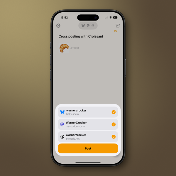
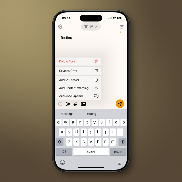
Indigo is the creation of Soapbox, the developers who created crossposting app Croissant. (I wrote about it when it released.) While Croissant allows you to cross post to Mastodon, Bluesky, and Threads, (functionality I find useful), Indigo is meant primarily to merge and scroll through a single timeline of your Mastodon and Bluesky feeds. You can also crosspost to both if that’s your desire. Threads isn’t included, as it doesn’t allow for viewing its timelines in the same way, which is curious as it is supposedly federated with Activity Pub.
If scrolling social media feeds is your thing, Indigo is certainly worth a look. It’s very well designed, and easy to discover its functionality.
It’s a first version of the app, and as one of the developers, Aaron Vegh says on his blog, “The Indigo we’re shipping today is going to be the worst version.” For the worst and first version, I believe Aaron and Ben McCarthy have done an excellent job. (You should read both Aaron’s and Ben’s blog posts. Ben’s describes the functionality quite well.) Having followed the development of Croissant since its release, I’ll say that the care they’ve used in the past with that app points to the same for the future of Indigo.
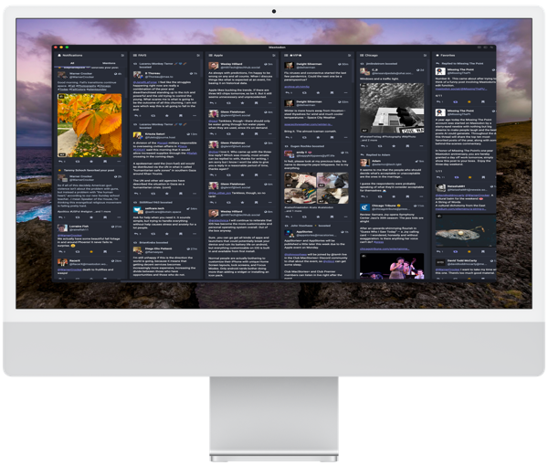
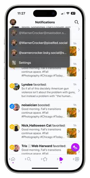
If you use both Mastodon and Bluesky, once you sign in to both through Indigo, you see your feeds merged together. You don’t need to use both social networks. The functionality is the same if you prefer only one of the two social networks. So, if you’re user of only one, it could replace whatever app you might currently be using.
One of the nicest design touches, and obviously an essential one, is that it’s easy to distinguish where things are coming from if you merge your timelines. Mastodon links are purple and those from Bluesky are, well they’re blue.
You can tell if a post is crossposted between the two networks, and another nice feature is that Indigo will merge the two in some cases (timing plays a part) so you don’t see them twice. You can switch between each version and take actions like quoting or replying to both at the same time.
If you’ve used Croissant to crosspost, doing so on Indigo will feel very familiar. Notifications, should you choose to receive them on your device, work as you would expect. The Notification tab in the app is quite well done and easy to understand.
The app is available for the iPhone, iPad, and Mac, and a single subscription covers you across devices. There is a free tier that’s read-only. If you’re interested in Indigo, the free tier is read only. That’s good way to determine if the excellent design of the app appeals to you.
If you use both social networks and would like to combine your feeds into one timeline I think Indigo is worth a look. Let me say this about Indigo and my social media usage. The single merged timeline feature has its attraction, but it’s not something that’s a high priority for me and that brings me back to the beginning of this post.
I like to keep my eye out for developers who focus on good design and good functionality. That’s the case with Indigo. As in this case, an app may not fit my needs, but I’ll remember the developers or company behind it. It’s much the same way I follow good theatre or film directors, and good writers.
I don’t see many new ideas or new needs to fill coming down the software or app pike in the near future. That may say more about me than it does the software market these days. Even so, that view of mine has me paying even closer attention to those who care about the look and feel of what they produce.
(image from the author)
You can also find more of my writings on a variety of topics on Medium at this link, including in the publications Ellemeno and Rome. I can also be found on social media under my name as above. This site does not use affilate links.


