More Thoughts and Issues With macOS 26 Tahoe

Unfinished Tahoe is not a friend to developers or users

I wrote a bit earlier about some of my early thoughts on the new OS 26 releases and here’s a few more to share about macOS 26 Tahoe. I continually beat a drum about the fact that we’re all on Apple’s beta bus, whether we opt in to receiving betas or not. I don’t opt in. Several of these thoughts keep that percussive refrain rumbling along through the issues below.

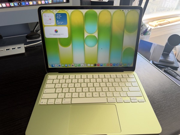
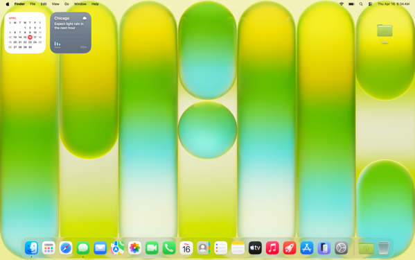
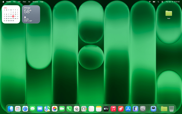
MacOS 26 Tahoe purple.

Memory Leaks

Since the release of macOS Tahoe 26.0.1 I’ve seen strange memory leaks increasing for what I think are odd reasons. For example, a process known as IconServicesAgent increases the longer I go between rebooting sessions. According to documentation I’ve found online, one of the causes of this can be an overly large or corrupted icon cache, or specific icon causing the problem. A solution is to clear the icon cache, which I’ve done, but the problem reoccurs.

I don’t have the expertise or the patience to tray and track down which icon(s) may be the issue, so hopefully this gets fixed in an upcoming release.

CleanShot 2025-10-17 at 09.35.13@2x.

My hunch is this has to do with icons being a lower priority for developers who still have a lot of other work to do on their apps. I base that on the number of non Apple app icons I see that haven’t been updated for Liquid Glass.

Notifications Memory Leak

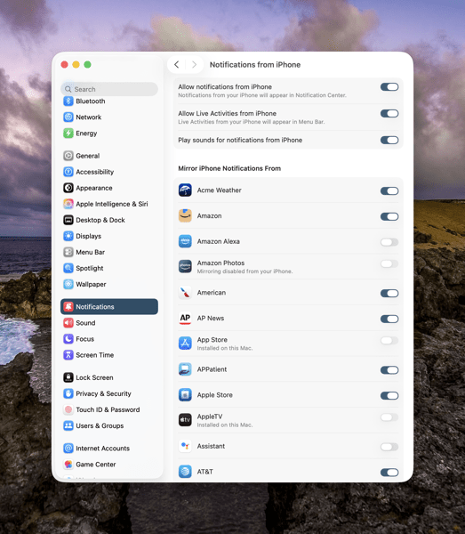
There’s another memory leak that I see less frequently and seems a bit more random. You can see in the image above the amount of memory NotifcationsCenter is consuming. Apparently this “occurs when a program holds onto references to objects, like activities or other resources, even after they are no longer needed, and uses the notification system as a way to do so.”  It’s tough to pin down whether these memory leaks are the fault of developers hindered by Apple’s choices, or just a system bug. Either way it’s far from optimal.

Again, I don’t have the expertise to sort this out, so I’m hoping for a fix in an update down the road.

Notification Summaries

Prior to macOS 26 Tahoe I had long ago turned off Apple Intelligence’s Notification Summaries on macOS Sequoia. I turned them back on with this new release to see if things improved. They did not. In my experience they are just as bad and just as useless as they were previously. So I’ve turned them off again.

Liquid Glass, Corners, and Such

I find the general acceptance that Apple made Liquid Glass less of a priority than it did on other device platforms amusing because it’s not only true, it’s true in the way a red wine stain shows up on a white shirt or blouse. That said, the somewhat half-way approach we do have, while not a deal breaker, is becoming increasingly more visually annoying.

CleanShot 2025-10-17 at 16.19.10@2x.

The lack of contrast for Sidebars always jerks my attention away when I have a sidebar open because for someone who once had real vision issues due to cataracts, it triggers a flashback to when I first started noticing those since corrected eye issues. The screen shot above makes it look like there is greater contrast than what I see in actual practice.

I’m also just not buying the entire concept of bringing “more focus to content.” Again, it’s more distracting than focusing. The more I see it the more distracting it becomes, which I’m guessing is antithetical to what Apple’s designers were hoping. This is true on iPhones and iPads as well.

CleanShot 2025-10-17 at 16.20.14@2x.

Widgets

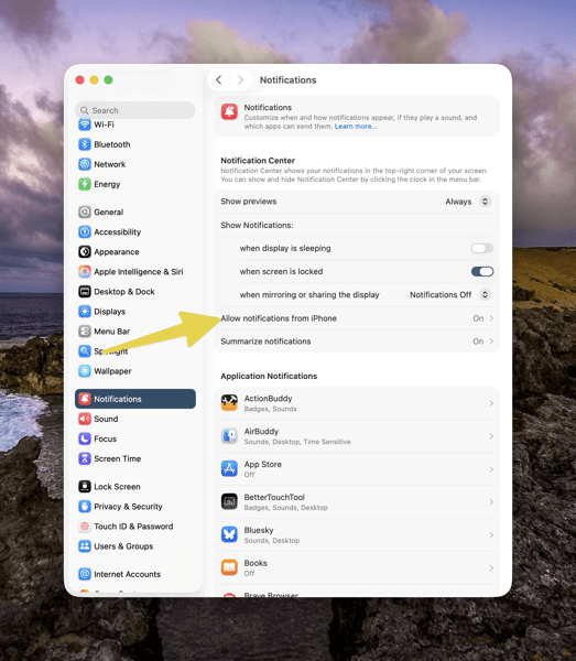
This is one instance when the drum beat of bad beta behavior sounds loudest. Again, I do not run betas on any of my devices. Yet, each time that Apple releases a beta for the next version of macOS 26 all of the widgets I use on a secondary screen will disappear the morning before the release. I can set my clock by it. I’ll go to the trouble of restoring them. Within the next day or so duplicates of those widgets will appear, but strangely now revealed under Notifications.

CleanShot 2025-10-17 at 13.11.28@2x.

At first I deleted the duplicates but after this week’s beta release I noticed that they eventually disappeared on their own. It’s odd behavior to say the least.

Control Center

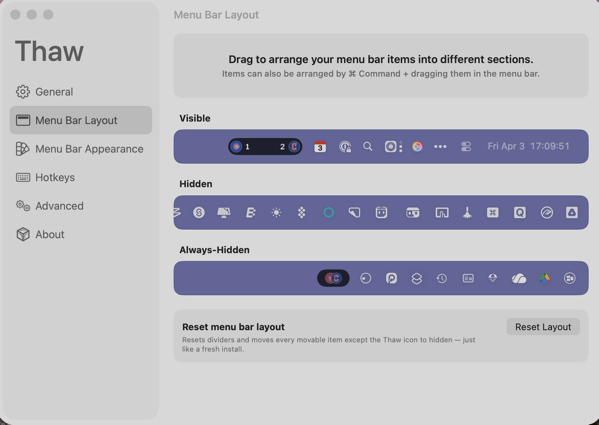
Speaking of Control Center, Apple is obviously hoping to move a lot of what functionality available in Menu Bar icons into the Mac Control Center. Apple has provided an API for developers to make that possible so that user can access those functions from the Control Center instead of the Menu Bar. I have very few apps that have taken advantage of this so far, again speaking to the slow pace of adoption by developers with other priorities.

CleanShot 2025-10-17 at 16.33.03@2x.

Even so, the two I have placed in the Control Center are sometimes present and sometimes not. To my surprise they appeared this morning. Not surprisingly they do not appear this afternoon, merely showing a place holder.

Control Center Notifications

Apple moved Notifications for things like Bluetooth and WiFi connections, volume sliders, and other functions so they animate out of the Control Center. That means they pop out in the upper right hand corner of the screen. That said, I find when they do animate they either distract me from what I’m doing, since I’m typically looking at the center of the screen, or my muscle memory of looking for them in different locations causes me to miss them entirely.

CleanShot 2025-10-17 at 16.39.54@2x.

The beta drumbeat pounds on

It’s been obvious since the release of macOS 26 Tahoe that Apple has a lot of work still to do. Some of that obviously was by design due to time and resources. Fine, but not fine. You can’t expect high performance out of a F1 race car unless your pit crew can nail the basics. As it currently stands Apple has its shiny new car well polished for pictures and demos, but is obviously still behind with its own engineering, throwing more delays at developers in the pit, in turn leaving users wondering about the turns ahead.

I frankly don’t see these gaps closing until sometime next spring at this point. Just in time for Apple to begin shifting resources to whatever comes next. I find that sloppy, unsettling, and like a lot of things Apple-like, not very Apple-like these days.

You can also find more of my writings on a variety of topics on Medium at this link, including in the publications Ellemeno and Rome. I can also be found on social media under my name as above.


Stop Snoozing and Wake Up: Apple Changes Alarm Shutoff Screen

If you snooze, you lose

It was a real wake up call for me when news broke recently that in the next major update to iOS 26 Apple will be changing the wake up screen for alarms. The change means that instead of having two buttons, one above the other to either Snooze the alarm or Stop the alarm, users will now have to Slide a button to turn off the alarm.

PXL 20251013 144935012.

This shouldn’t have been that much of a surprise for me as prior to iOS 26, the snooze button was a big orange one and the “button” to turn off the alarm was below it and much smaller. I can’t tell you the number of times I, and my wife, accidentally hit the snooze button instead of turning off the alarm.

To my tastes, Apple fixed that in the initial release of iOS 26 by making the buttons of similar size, even if the Snooze button still grabbed all the glory and color.

Here’s the thing. Of course how you wake it up is a very personal preference. Personally, I’m not a snoozer. When it’s time to wake I want to wake up and get moving. But apparently the majority of the world prefers snoozing, as do the folks making decisions in Cupertino. When you think about it explains quite a bit about so much when it comes to meeting the challenges of each day, whether in the real world or in tech.

What’s that old saying, if you snooze, you lose? I think that’s it.

I can only imagine how many iPhones are going to be knocked off of bedside tables as semi-awake users attempt to slide the button to silence an alarm. If I was responsible for the design, I’d have made it more challenging to hit a snooze button than to hit the wake up button.

But that’s just me.

You can also find more of my writings on a variety of topics on Medium at this link, including in the publications Ellemeno and Rome. I can also be found on social media under my name as above.

Apple’s Freezing Out Another ICE Related App: DeICER

Apple continues working for ICE

I’ve linked to coverage about Apple purging apps that are designed to help those looking to protect themselves from the Trump regime’s ICE actions including ICEBlock and Eyes Up. Add another one to the list, this time the app is called DeICER.

According to Pablo Manríquez of Migrant Insider, DeICER is a “civic-reporting app used to log immigration enforcement activity.”

Manríquez goes on to suggest that Apple effectively is treating federal immigration agents as a protected class of individuals. HIs article also includes an account of an interview with the app’s developer Rafel Concepcion over Apple pulling the app and the app’s intended purpose. It is worth a read.

In Chicago, these are dangerous and confusing times, even more so depending on who you are, what you look like and where you live. With a largely unhelpful media, it is challenging for anyone concerned to find accurate info or, as in the case of Eyes Up, preserve what they may have seen or recorded. Do note that recording info with smartphones is one of the methods of resistance Illinois and Chicago officials are encouraging citizens to perform in the face of these actions.

Even so, there are areas of Chicago wherein you would never know this kind of thing is happening. Local independent media is stepping up its game, but unfortunately doesn’t have the reach that large outlets do.

Apple isn’t alone in their cowardly actions. Google is also pulling apps of similar ilk. Both companies are referring to their respective App Store guidelines in their defense of their actions with Apple telling Concepcion,

Information provided to Apple by law enforcement shows that your app violates Guideline 1.1.1 … because its purpose is to provide location information about law enforcement officers that can be used to harm such officers individually or as a group.

These ICE enforcement actions want to project toughness in their aim to intimidate and harass, but by and large each of these maneuvers to hide what they are doing only serves to show how afraid those responsible for these actions actually are of the chaos, fear, and harm they are causing, regardless of the chest-thumping content they are creating on their raids.

The only ones who appear more afraid are Apple and the other big tech and media companies that keep going along to get along.

You can also find more of my writings on a variety of topics on Medium at this link, including in the publications Ellemeno and Rome. I can also be found on social media under my name as above.

AirPods Pro 3 Review: Hits and Misses

Not quite the right fit, but still a hit in my ears

In showbiz you know you can never please everybody no matter how hard you try. The same is actually true when it comes to any product, including tech. Especially hardware.  Especially hardware you stick in your ears. Add that layer and the odds of pleasing everyone decrease substantially, even if you do create a hit.

Apple’s AirPods have generally been perceived as a hit product since their debut even though the first version was made fun of for its initial appearance. Each iteration gained more fans along the way with the AirPods Pro 2 being more than generally regarded as quite a hit.

The AirPods Pro 3 got early overwhelming raves but as more folks have tried them in more ears some of those first blush raves have been joined with more tempered opinions. Apple made a big deal about improvements in both the sound AirPods Pro 3 deliver and also how much testing they did to find the best fit for the most people. In my experience Apple scored a hit when it comes to sound and noise cancelation, but a more of a miss when it comes to fit.

First the hits

I’m a long time AirPods user and have long considered the AirPods one of Apple’s best products. They are not perfect, but they are good products I rely on. That said, I’ve never quite bought in to what I consider the myth about how good Apple’s active noise cancellation is with previous models. It has improved along the way. But to my ears it was never quite as good for me as it was promised and as it was ballyhooed by so many. It was fine and certainly better than not having it when mowing the yard, flying on a plane, or washing the dishes, but not quite as promising as Apple and others described.

That said, in my ears the active noise cancellation for the AirPods Pro 3 takes a substantive leap. The first time I noticed the improvement was in my kitchen. I had been listening to a podcast while washing the dishes. My wife came in to ask me a question. I paused the podcast, answered the question but I didn’t turn the podcast back on as I was finishing up.

I left the AirPods in as I was doing the usual clean up of kitchen counters and my wife came in again to help. We chatted a bit and then I went in the other room. This entire time we had been running our window air conditioner as temperatures had been running warmer than usual for this time of year. As I passed back and forth through the kitchen my wife and I chatted. On one of those trips I noticed that I didn’t hear the sound of the window air conditioner and I asked her if she had turned it off. With her verbal reply that she hadn’t, the sound of the AC returned. Again I was not playing any audio at the moment.

When she finished talking the noise of the air conditioner just stopped. I told her what I was hearing and it returned with my voice. It was literally as if we were using an on/off switch.

This morning as I was mowing the lawn for what I hope is the last time this season, I did some A/B testing between the AirPods Pro 2 and Pro 3 models. There was a decided difference with the lawn mower with the AirPods Pro 3 being much better at muffling the sound of the mower. It didn’t kill it completely, but it did muffle it more.

So in terms of improving noise cancellation I would say Apple certainly set a new mark.

I’m not an audiophile by any stretch of the imagination and I use my AirPods to primarily listen to podcast and audio books much more than I do music and other entertainment. In that A/B testing during my lawn mowing chores and afterwards I’ll say I didn’t notice that much of, if any difference in the audio quality of the podcasts I was listening to, but adding in the better noise cancellation I’d say I heard better over the more muffled mower.

Continuing to listen after my yard work in quieter indoor environs, I was quite pleased with the quality of the sound, but no more so than with the AirPods Pro 2. So, in my listening I’d call it a wash as far as audio quality is concerned.

The Misses

In the two experiences above I was using the AirPods with noise cancellation turned on. Apple’s AirPods feature three different listening modes, Noise Cancellation, Adaptive, and Transparency. Noise Cancellation seeks to cancel outside noise, Transparency lets outside noise in but still focuses the audio you’re listening to, Adaptive is somewhere in between, supposedly adapting to external noise to raise the signal you’re listening in balancing against outside noise as it may come and go.

When I’m walking and listening I’ll use the Adaptive mode to have awareness of what’s around me. I walk on city streets and in city parks and I’ve never felt satisfied with the myth of the Adaptive listening mode. I still don’t with the AirPods 3. When introduced Apple trumpeted “a new listening mode that dynamically blends Transparency mode and Active Noise Cancellation together based on the conditions of a user’s environment to deliver the best experience in the moment.”

In theory, the Adaptive mode should help decrease louder external sounds (leaf blowers, lawn blowers, city buses, etc…) but that’s never really worked well for me in practice. My experience with AirPods Pro 2 was there might or might not be an adjustment. It was always inconsistent, and if there was an adjustment it was quite slow in reacting to external sound, often doing so after a loud vehicle and its noise had passed.

I haven’t really given this much time with the AirPods Pro 3 but in the brief time I have, I’ll say that when there is an adjustment the response seems a bit quicker. But again, it’s inconsistent when that happens. Overall I’d rate this as about the same as the AirPods Pro 2  in that it is not really a feature that works for me.

The biggest miss for me with the AirPods Pro 3 is the fit. But there’s somewhat of a caveat that goes along with that statement. I can’t say I’ve ever been satisfied with the fit of any of the AirPods that I’ve owned. The AirPods Pro 2 came the closest. But even then I’d occasionally have difficulty keeping them in my ears or wearing them too long.

This year Apple worked hard on creating a physical design for this new generation to try and find the best fit for the most ears. The ear tips are foam-infused to create a better seal in the ear, which along with the computational audio contributes to the better noise cancellation I spoke of earlier. That said, these ear-tips constantly remind me of their presence more than the others did and after a while feel uncomfortable.

Apple also included more sizes of ear tips, again aiming for a better fit for more ears. If you run the Acoustic Seal test it can theoretically guide you to the best fit. Here’s an interesting personal tidbit. I have achieved a good seal with both the Medium sized ear tips and the Extra Small sizes, but not the Small. I’m not sure what that means.

I credit Apple with continuing to try and find ways to accommodate customers, but I think Apple’s challenge speaks more to the size and variable anatomy of its potential market than it does to any failure. Certainly ears come in all shapes and sizes. Apple claims it scanned 10,000 ears. I’m betting if it scanned another 10,000 there would still be fit issues for some customers. After all, we’re told since childhood not to stick anything smaller than our elbow in our ears.

Other Features

Apple continues to add and improve Health related features to the AirPods Pro lineup this year adding  a custom-built heart rate sensor. Apple has also added Live Translation as a feature that’s currently in beta. For the former I haven’t used the AirPods Pro 3 long enough to test the feature, and I haven’t even attempted the latter.

Summary

All in all, even with some misses, the new AirPods Pro 3 leave me in the same place previous editions have. It’s a very good Apple product that’s not perfect by any means, but it is good enough for me to want to keep using it even if it’s not a perfect fit. As I’ve previously gotten just under two years of good life out of earlier models before I notice battery life degrading, I imagine I’ll be using these for the next two.

You can also find more of my writings on a variety of topics on Medium at this link, including in the publications Ellemeno and Rome. I can also be found on social media under my name as above.

Apple Ices Ice Tracking App

The big chill continues freezing Apple

Apple gave itself another public relations black eye last night by agreeing with U.S. Attorney General Pam Bondi and pulling the ICEBlock app from the App Store. 404 Media has more on the story here. 

Piece of ice cube melting.

ICEBlock has proven to be a popular, and much needed app in these days when ICE agents are working to fulfill Donald’s Trump mass deportation fantasies with too large of the population cheering him on. It allows users to pinpoint ICE activity on the app for others to see and possibly avoid the area and take precautions.

The developers of ICEBlock are saying they will fight the expulsion, sharing the following email from Apple with 404 Media:

Hello,

We are writing to let you know about new information regarding the latest approved version of your app, which could impact its availability on the App Store.

Upon re-evaluation, we found that your app is not in compliance with the App Review Guidelines. Specifically, we found your app is in violation of the following:

1.1 Objectionable Content
Apps should not include content that is offensive, insensitive, upsetting, intended to disgust, in exceptionally poor taste, or just plain creepy. Examples of such content include:

1.1.1 Defamatory, discriminatory, or mean-spirited content, including references or commentary about religion, race, sexual orientation, gender, national/ethnic origin, or other targeted groups, particularly if the app is likely to humiliate, intimidate, or harm a targeted individual or group. Professional political satirists and humorists are generally exempt from this requirement.

Information provided to Apple by law enforcement shows that your app violates Guideline 1.1.1 because its purpose is to provide location information about law enforcement officers that can be used to harm such officers individually or as a group.

For this reason, your app will be removed from the App Store. Customers who have previously downloaded this app will continue to have access to it on their devices, but they will be unable to re-download this app from the App Store or restore this app from a backup if they delete it from their device. Additionally, customers will be unable to purchase in-app purchase products and any auto-renewable subscriptions will be canceled. The TestFlight version of this app will also be unavailable for external and internal testing and all public TestFlight links will no longer be functional.

Best regards,
App Review

In a statement to CNBC Apple said:

We created the App Store to be a safe and trusted place to discover apps. Based on information we’ve received from law enforcement about the safety risks associated with ICEBlock, we have removed it and similar apps from the App Store.

Apple has in the past pulled other apps from App Stores after government pressure from other countries, always stating that they have to follow the laws of the countries that they operate within. To my knowledge this is the first time this has happened in the U.S.

Apple and its CEO Tim Cook remain under intense scrutiny for blatantly undisguised subservience to the Trump administration on a number of fronts to avoid tariffs and other threats wielded against the company. But they are not bending their knees alone.  AG Bondi pointed out other apps available on Google’s App Store that provide similar services saying “Your move, Google.”

Let’s face it. Both Apple and Google, as well as other big tech and media companies, have proven to be easy (too easy) marks for this criminal regime’s bully boys and girls. Their capitulation has taken the wind out of any progressive sails that these companies previously used to cultivate and build brand loyalty, creating new legacies that will last longer than any zig-zagging line on a profit-loss chart. This latest capitulation certainly continues to put a chill on any good will sympathies users have for these companies and their products.

That said, Apple and Google know well their dominance of the mobile operating system market leaves the vast majority of consumers with little choice in this topsy-turvy new world bound by the inertia of every day life as much as gravity. Certainly there are other options out there, but the number of users willing to jump through the hoops to get away from this capitulating corporate behavior is small, and at the moment I dare say insignificant. That will remain the case because there certainly doesn’t appear to be an opportunity for alternative mobile operating systems to surface, capture attention, and take hold, given the current environment.

Chilling times indeed.

You can also find more of my writings on a variety of topics on Medium at this link, including in the publications Ellemeno and Rome. I can also be found on social media under my name as above.

OS 26 First Impressions

Early thoughts on OS 26 versions

Bubbles. My grandkids love bubbles. It’s a kid’s delight. Apparently bubbles also delight some Apple designers. My first impression of the look of iOS 26 on the iPhone was bubbles.

PXL 20250916 124836790.

I watched the OS 26 round of operating system betas over the summer as things evolved and have now installed the first release on all my devices. I’ve seen and heard the reactions so I was reasonably prepared for what would happen once the updates occurred. These are some first impressions after taking a look.

Liquid Glass

I’m not putting down bubbles. Bubbles are fun, whimsical, and joyful. But my overwhelming impression on the iPhone 16 Pro with iOS 26 installed was that the Liquid Glass design language, (that supposedly isn’t a design language,) felt very bubbly and child-like. To my eye I associate it more with bubbles than I do glass, liquid or not.

I also thinks Liquid Glass looks and feels better on the iPad Pro than it does on the iPhone. There’s more space for the chunkier, bubblier UI elements to float around. By and large things look cleaner on the iPad.

On the Mac, Apple didn’t go quite as far with Liquid Glass as they did with the iPhone and iPad regarding transparency and bubbly things, but there is still a more cartoonish feel to macOS 26 than the previous version. I think most of that is due to the rounded corners, rounded buttons and tab bars. I will say in this early going, I miss what I felt was a cleaner design in Sequoia on the Mac than what I see in this early going with Tahoe.

Bubbles are also messy things. Messier than glass in solid form certainly. Perhaps applying liquid properties to this glass like interface provides a license to keep things messier. That’s certainly true in some cases on the iPhone. For example, in the Phone app the reflective (or is it refractive) qualities around the buttons make it feel like light is leaking through a misapplied sticker than I think was the intent.

New Shareshot.

On both the iPad and the iPhone you’ll have to be careful what you choose for a wallpaper, because that same light leaking through means photos that have many colors or light contrasts within them appear more distracting than pleasing. (I like to use my own photography for wallpapers).

New Shareshot.

The issues of legibility have been discussed quite a bit over the summer, and I don’t think Apple has a complete solution for that yet when it comes to complex backgrounds, other than seemingly to force users to make simpler choices with wallpaper backgrounds. In early use, I think what we see on iPhone and iPad completely renders useless the statement of letting your content shine through. It might bleed through, but if it shines it does so in a distracting manner.

Here’s an example of one of my Home Screens that I think makes things look more bubbly than Liquid Glassy, especially in the upper two rows of folder icons.

New Shareshot.

Alan Dye, the VP of Human Interface Design, the Apple guy who spearheaded this UI change, is quoted as saying that Liquid Glass is “the foundation for new experiences in the future.” All well and good when you have a fuller view of the future as one assumes he would. But for those looking at their devices today, that means as much or as little as any tech promise or vision that have been dropped on us these last few years.

Liquid Design, in my very early looks is not to my taste. It may be to yours. the good news is that everything still appears to be functional. But to me, it’s a child-like appliqué on sophisticated devices that seem to beg for something more mature. I’m sure Liquid Glass will evolve, but until it does, I don’t think these bubbles will be popping soon.

Other Changes

I haven’t explored many of the new features of any of these new operating systems, only attempting to get things up and running. Most things appear to be running well.

A few changes I like include:

I prefer this iteration of the Photos app in iOS

I like the big multi-tasking changes for iPad and look forward to working with them more, although count me as one who will miss Slide Over. It was handy in my work in rehearsals.

I like the new Trash Can icon on the Mac. That’s the kind of whimsy I can support.

CleanShot 2025-09-16 at 07.18.24@2x.

I love the wrist flick gesture on the Apple Watch.

Things I’m not a fan of:

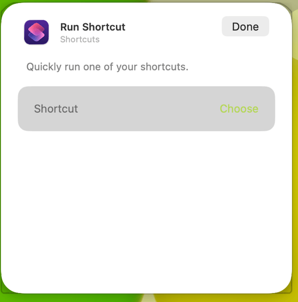
On the Mac I miss the Shortcuts item in the menu bar. Yes, you can add one, but instead of getting a straight drop down of clickable Shortcuts, it now opens a new window that requires not only the selection of the Shortcut you want to execute, but another separate action to run the Shortcut. Adding clicks isn’t much of a shortcut to me.  I see where Apple is going with this, trying to move things out of the Menu Bar into the Control Center. That’s going to require developers to make that move successful.

CleanShot 2025-09-16 at 10.04.19@2x.

I’m not a fan of some of Apple’s redesigned icons.

I tried out the Tinting feature for icons. I could see myself using this, if the feature didn’t tint widgets. What’s the point of a tinted Photos widget?

New Shareshot.

Some things I’m on the fence about:

I’ve previously used independent apps Bartender and Ice to control the large number of Menu Bar icons I like to have available. Both are currently in beta so I’m testing out Apple’s  feature to hide the Menu Bar until things change on those fronts. Simply put, that means the Menu Bar disappears until I hover over or click on it, revealing the icons. In using this feature when windows are at the top of the screen, Menu Commands sometimes disappear requiring some window rearrangement. This doesn’t happen consistently, so I’m guessing it’s a bug. I’m not sold on this in the early going but I’m giving it a try.

I’ve been using Raycast as an application and Shortcut launcher, along with some of its other features. I’m giving Apple’s new Spotlight features a try including the long overdue Clipboard Manager. This will require some muscle memory retraining, and it might mean leaving Raycast behind. It would be easier to do so if that Clipboard Manager copied across devices.

It’s early going. For me, as well as these new operating systems. I’ll discover more as I go along. I’m hoping the evolutionary pace for this software from Apple and most certainly developers will come close to matching mine in the days to come. I’m guessing it’s going to be sometime in 2026 before we can really evaluate what’s what in these OS 25 releases.

You can also find more of my writings on a variety of topics on Medium at this link, including in the publications Ellemeno and Rome. I can also be found on social media under my name as above.

Things Apple Won’t Fix In The Next Round of OS 26 Updates

I’d bet money these issues persist after new OS releases

Apple is announcing new iPhones, Apple Watches and possibly other things today. They’ll also announce the release date for the operating systems for all of those new devices and previous generations already in use. All of the focus is going to be on everything new, improved, changed and Liquid Glassed.

55b31eb4ba867b00263c62f538280311 XL.

I’m sure I’ll write about some of that down the road. For today I’m writing about the things I’m thinking Apple won’t address in any of the new operating systems. These are lingering issues that in some cases have not been corrected over the life of multiple operating systems. As much as I get excited about a new software release I remain frustrated year after year when Apple steps forward while dragging its feet on correcting existing problems.

Believe me, I get that Apple has created such a large ecosystem that it is impossible to pay attention to every detail and correct every mistake. I get it, but I don’t sympathize with it. Introducing new operating systems pumped out on what seems like an impossible to meet annual cycle creates other issues that need to be addressed and it is apparently too easy to just let the older ones go unattended. And from what I’ve seen from developers I follow, there are going to be a host of new issues that are going to need to be resolved over the next year. Or longer. The longer you let an existing issue hang around without attention, the more the “control the whole widget” promises seem not quite in control.

Certainly it’s a question of priorities. How the priorities are set makes me question the priorities of those that set them.

Some of these issues I’ve highlighted before, others I have not. Here are a few that continue my questioning of Apple’s priorities. I’m sure there are some that others experience that fall into the same category of hoping Apple pays attention to them someday.

Syncing

I’ve seen a decrease in syncing issues with iCloud in general. That’s a good thing. But Apple still insists on syncing Photos on its own schedule. Whether it’s battery life optimization or system optimization the delay is never optimized for the user experience.

Shared Reminder Notifications

I’ve written about this before. The fact that this one hasn’t been corrected since Shared Reminders became a thing undercuts all of the very good work Apple has done with the Reminders app in general.

Bluetooth Weirdness

I don’t know how else to describe this other than it’s just weird. There are times when Bluetooth connectivity works as designed with my AirPods and other peripherals. There are times when things just go bonkers especially with AirPods. Things will work as designed for days on end, then they won’t. AirPods switch between devices as designed, but then stop doing so. Adaptive Listening will work well sometimes and sometimes not. Connectivity with my car works well and then it doesn’t. My car isn’t smart by any stretch of the imagination and gets no software updates so it makes sense to me that it’s a Bluetooth issue on the iPhone. Note that it happens at random times unrelated to iOS updates or those mysterious AirPod firmware updates. The Magic Trackpad works 98% of the time. Then not. It’s weird.

Shortcuts

It’s become either a legend or a joke that every time Apple releases a new update (full release or point release) something goes wrong with Shortcuts. Either way it’s a problem for “the future of automation.” I particularly love it when a Shortcut just hangs with no indication that there’s a problem after working well for days on end. This inconsistent problem is consistent.

The App Store

Apple’s biggest retail outlet is the slowest loading and buggiest piece of software it has ever designed. It’s also designed abysmally.

Focus Modes

I use very few Focus Modes. I do not share them between devices. Sometimes they work. Sometimes they don’t. I’ve never set a Sleep Focus on my iMac. Yet one mysteriously appears at random during the day about twice a month. The Focus I’ve set for listening to Podcasts inconsistently fails to kick in.

Mail Rules

I think Apple has just given up on Mail Rules because the ones I’ve built just don’t work anymore.

Apple News

I enjoy that on my Mac I can choose to open an article in Safari or that I can open a webpage in Apple News. I don’t understand why that can’t happen on the iPhone.

Notification Summaries

I long ago turned Notification Summaries off because they were just confusing and caused more work than just dealing with the Notification. I recently turned them back on to check and see if there had been any improvement. There has not.

As I said, I don’t anticipate Apple fixing any of the above with all of the new ’26 releases. I’ve learned to work around them the same way I work around the passenger side backdoor on my car won’t open from the inside and I have to open it from the outside whenever I’ve got a back seat passenger. It’s a walk around workaround. It’s not ideal. And each time I have to do it I’m reminded just how imperfect things are and can be. I’m sure it will diminish the value of the car when I do decide to trade it in, but it’s already reduced the value of it in my mind.

I feel the same way when Apple doesn’t address longstanding issues that I and others have brought to their attention. Here’s hoping Apple addresses some of these issues. Here’s hunching they won’t.

You can also find more of my writings on a variety of topics on Medium at this link, including in the publications Ellemeno and Rome. I can also be found on social media under my name as above. 
Sunday Morning Reading

Things AI can’t summarize: Nostalgia and what’s worth not forgetting.

A brief breather at home before travels resume, so there’s a full plate for this week’s Sunday Morning Reading including some nostalgia that shouldn’t be, some very interesting reading on AI, a defiant Chicago, and even a bit on gambling and baseball. Enjoy.

Roman kraft _Zua2hyvTBk unsplash 1.

Chicago is under threat from a madman and you can feel the tension in the crisp fall air. Dan Sinker has written an excellent Benediction for Chicago On the Eve of Occupation. You don’t hear thoughts and prayers in the check out lines at the grocery store,  just a growing sense of defiant preparation.

The pendulum seems to be swinging wildly in the opinion wars about Artificial Intelligence now that some are actually able to sift through the hype bubbles and see what’s what. EmptyWheel has an excellent 4-part series that is more than worth your time. It begins with A Normal Person’s Explainer On What Generative AI Is And Does and continues with The Other Half Of The AI Relationship, Proteins, Factories, And Wicked Solutions, and concludes with LLMs Are Lead.

Follow that excellent series with The Tech Industry Has a Dirty Secret: The More People Learn About AI, The Less They Trust it by Victor Tangermann. For what it’s worth, I’m also seeing AI naysayers riding the pendulum back the other way as they find ways to make some of the tools of this tool work for them. No AI could ever sort this out with a summary.

The Power We Use and The Power We Give is a brilliant piece by Philip Bump. As he transitions from his former job with The Washington Post he’s talking about where choosing to land next and why making the right choice about where to exercise what power the words you use live. This is a complicated moment in history on so many levels, well illustrated in this one man’s piece.

Also, here’s an excellent piece from Bump on the goings on in Chicago called Trump Wants To Make War On Chicago. He Picked The Wrong Fight.

Speaking of complexity, David Todd McCarty wonders why so many men find themselves alone later in life in Boys Don’t Cry, Men Don’t Bond.

Chris Armitage says It’s Time For Americans To Start Talking About “Soft Secession.” I take the point about the term and the concept. I’m not criticizing either or Armitage’s piece when I say this, but hell, when the president of the country mockingly riles up everyone with a threat to declare war on a city, I’m not sure there’s anything “soft” about anything anymore.

NatashaMH tackles political amnesia is what I think is a timely piece worth revisiting more than once. Our capacity to forget or set aside so much, so often, is astounding. Check out Inside The Fortress, Outside The Fire. Here’s the money quote:

As often as I can, I remind them how history is a reminder of the lives we lost and of how stupid we really are. “Senseless to the core. And once we’re done with the bloodshed, we write poetry.”

To clear the palette a bit, check out Tim Newcomb’s piece about how A Remarkable Discovery of A Document Shatters One of Shakespeare’s Biggest Mysteries. 

Fact checking may be a dying art, given that most of the world has decided we can each have our own facts. Zach Helfand as a wonderful long piece on The History Of The New Yorker’s Vaunted Fact-Check Department. Too damn bad we have to file this under nostalgia.

Speaking of nostalgia, check out Bettor Up by J.R. Moehringer about gambling and baseball. Yes, it’s about gambling and baseball, but it’s the closest thing I’ve seen to the good sports writing (especially about baseball) that I grew up with.

(Image from Roman Kraft on Unsplash.)

If you’re interested in just what the heck Sunday Morning Reading is all about you can read more about the origins of Sunday Morning Reading here. If you’d like more click on the Sunday Morning Reading link in the category column to check out what’s been shared on Sunday’s past. You can also find more of my writings on Medium at this link, including in the publications Ellemeno and Rome.

Instagram Shows Up Very Late to the iPad Party

What’s the point and who cares?

The folks at Meta must have something up their sleeve. The reason I say that is they have finally, after all of these years released an iPad version of the app, long after most folks just figured it would never happen. Other than speculating on what might be behind the late to the party move, at this point it begs the question, Who cares?

Reels with Comments 16_9.

I’m sure plenty do care. I’m not one of them. Instagram is one of a few apps that I begrudgingly use. Begrudgingly because I hate it. I use it because my family on all sides continues to do so and it’s a way to keep up with grandkids, nieces, nephews, and other family news. But I honestly despise that I have to. Believe me I’ve tried to wean them off onto other apps and services, but it never sticks.

Every time I do open Instagram I have to block somewhere between 5 and 10 spam accounts (too often porn or ridiculous come ons.) And of course the algorithm doesn’t show me what I want to see, but what it wants me to see. There’s even an increased sense of desperation from both Instagram and Facebook sending out notifications telling me someone replied, is waiting for my reply, or commented on something I haven’t seen yet. It’s like begging in the street. Apologies to those who might actually need to do so.

Sure I could turn off the notifications, but sadly, that’s the least worst way to use the app to keep up with family happenings.

I’d say that since it took 15 years for Meta to finally roll this out that perhaps the adolescents in charge finally are growing up. But then, there are those porn accounts that pop up with the frequency like prepubescent zits.

I won’t be putting it on my iPad. It’s troubling enough that I still have it on my iPhone. And as I watch the over excited coverage rolling in, I haven’t seen any image of the iPad version that makes it look the least bit appealing. It’s like Meta didn’t really care based on what I’ve seen so far.

So, Instagram is on the iPad. What’s the point and who cares?

You can also find more of my writings on a variety of topics on Medium at this link, including in the publications Ellemeno and Rome. I can also be found on social media under my name as above. 

Blood Glucose Monitoring on the Apple Watch Is Probably A Long Way Off

The annual hope and hype cycle

Every year as we near Apple’s iPhone and Apple Watch announcements rumors circulate and recirculate about Apple including a blood glucose monitor for the Apple Watch. It would be great if that happens someday. In my view it’s probably a lot further off than most of those hoping it happens want it to be. Here’s why I think that.

I’m a Type 2 diabetic. Checking my blood sugars has been a part of my life for 14 years or so. I’m painfully familiar with the prick your finger method and relied on it until a new endocrinologist prescribed a Dexcom G6 sensor. I’m now using a Dexcom G7 sensor. I don’t use an automatic insulin pump, just the sensors for monitoring via my iPhone and Apple Watch. I treat my condition with injected medication, both insulin and GLP-1.

The Dexcom sensors (both generations) were indeed a plus in my life as they provided a better way of monitoring, allowing me to better gauge diet and exercise, which will always be the biggest part of any diabetic’s regime.

But neither Dexcom model was a fire and forget it solution. There are times when I have to check my blood sugar with a finger prick because there are so many variables that can affect your glucose levels. The Dexcom system does provide a method to calibrate and recalibrate based on actual readings from a finger prick. I experience periods when I don’t need to recalibrate often and periods when I do.

If I’m traveling for a more than a day or so I have to pack my kit for finger pricks, because travel can be one of those variables. An inadvertent bump of the sensor on my arm can throw readings off for the remaining life of that sensor. (You have to change to a new sensor every 10 days.) AND to be frank, the tech is still far from perfect. Sensors fail occasionally and, as is the case with all tech that fails, it happens at the most inappropriate time.

Dexcom’s sensors are classified as a minimally invasive medical device. The device inserts a small filament under the skin, and yes it feels like a small needle insertion. That filament takes its reading from the interstitial fluid between cells. It does not read directly from the bloodstream. The device is held on by an adhesive patch.

When Dexcom introduced its Apple Watch app it was a decided monitoring improvement over the iPhone App which I viewed via a widget on my iPhone Home Screen. The iPhone widget far too frequently needed a touch of the screen which opened the app to update the reading.

The Apple Watch app offers a complication that displays data more consistently, needing less frequent touches to refresh the readings. (The complication is visible in the photo above showing a reading of 157.) That said, the Apple Watch tends to disconnect too easily from the sensor, defaulting back to displaying readings from the iPhone when that occurs.

I also find that the Apple Watch app reading is more current than what the iPhone is showing, but you do still need the iPhone app to communicate readings with your endocrinologist.

In some instances I’ll need to reboot both devices to reconnect things up on both my iPhone and Apple Watch. Dexcom technicians have told me these disconnections have to do with Bluetooth connection issues and are subject to the same vagaries and variables that exist with many other Bluetooth connections. I also need to be aware of which arm I have the sensor attached. I wear my Apple Watch on my left arm and if the sensor is on my right arm there will be more frequent disconnections. I don’t sleep with my Apple Watch on, so waking in the morning requires a waiting period for the watch app to reconnect.

The goal behind the push to include blood glucose monitoring on an Apple Watch (or any other smart device) is obviously to cut down on the need for finger pricks and possibly the use of minimal invasive medical devices. But also, in theory an on device sensor communicating directly with watchOS should show readings more consistently and be much less subject to the vagaries of Bluetooth connectivity.

I certainly can’t prejudge any new system or technology that hasn’t surfaced yet. Certainly I’m one who hopes Apple or some other company can eventually tackle this issue and provide a workable solution. That said, convenient as this annual rumor always seems to be, I believe blood glucose monitoring on the Apple Watch is a lot further off than most hope or think it might be. I’m also reasonably sure that finger pricks will still be needed if for no other reason than to calibrate sensor readings with actual blood glucose levels.

You can also find more of my writings on a variety of topics on Medium at this link, including in the publications Ellemeno and Rome. I can also be found on social media under my name as above.