Apple’s Changes To The Phone App Are Helpful and Confusing

Apple tries to improve the Phone experience

When the iPhone was first announced Steve Jobs uttered the now famous words about three products that would be combined into one:

Well, today we’re introducing three revolutionary products of this class. The first one is a widescreen iPod with touch controls. The second is a revolutionary mobile phone. And the third is a breakthrough Internet communications device.

The app for that “revolutionary mobile phone” has undergone few changes through the years since 2007, but nothing really to call home about. It can be argued that of those original three products, the phone has become perhaps the least important as users relied more and more on other methods of communication. This year with iOS 26, the Phone app got some significant changes. Some of which, at the moment, are proving quite helpful even if a bit confusing.

Let’s talk about the confusion first.

Apple introduced a new Unified View in the Phone app that consolidates Favorites, Recents, and Voicemails all under a single Calls tab. It sounds good to try and combine these features into one hub as a concept, but I find it confusing and some of the folks I support do as well. Apple also knew it could be confusing, providing users with a way to switch back to the prior Classic View with the familiar separate tabs for Favorites, Recents and Voicemail. Those folks I support are choosing to stick with the Classic View rather than learning something new. I’m swinging back and forth. 

New Shareshot.

Like anything else new this Unified View breaks muscle memory. That sort of change isn’t necessarily a bad thing, but coming after years of users trained on the same interface, it’s about as confusing as flipping the mouthpiece and the earpiece on an old landline phone would be.

If you choose the Unified View and designate enough contacts as Favorites, it’s also a damn ugly interface to look at.  Your Favorites are arrayed at the top with recent calls below.. If you tap on Show All, (the catch all bucket if you have more than seven Favorites) you’re taken back to the same list view from the older UI of the Classic View. (The Unified View is on the left and the Classic View is on the right in the image below.)

CleanShot 2025-10-24 at 15.28.27@2x.

I’m also confused at times about the differences between what’s a Missed Call and What’s an Unknown Caller as notifications sometimes, not all the time, appear in both places. Sometimes a call record will show up in three places if it’s also identified as a Spam call.

New and Newish Features

Hold Assist Detection sounds like a winner of a feature. In some cases it is. In some not. It makes me think that the designers of this feature have never used the Phone app to call a pharmacy or a doctor’s office where the person answering the phone is so busy that when they answer they speak so fast that you can’t understand what they’re saying. In my experiences attempting to use this feature in cases like those, the person on the other end just hangs up and I have to make the call again. I’ve yet to have a successful attempt at using this feature as designed other than testing it with friends.

New Shareshot.

As an intriguing side note, the same thing happened with a call to Apple Support.

Screen Unknown Callers is another new feature that works well in some cases yet not in others. It has certainly reduced the number of unwanted calls I’ve received since turning it on. The call screening happens before your phone rings, which apparently is enough to bring an end to a number of those calls. Sometimes those calls appear in the Missed Calls list, sometimes not. What I don’t understand is that some of these calls also show up as Priority Notifications while others do not.

There are three options for screening unknown callers. The first is Never, which means you aren’t screening and all calls come through. The second is Ask Reason for Calling, which queries the caller. The third is Silence which silences any unsaved numbers and sends them to voicemail, placing the log of the call in the Recents List.

I’ve been using the Ask Reason for Calling option and, as I said, it has cut down on the number of unknown calls I receive in a day. My wife and I received our current phone numbers when we lived in another state and area code, so we essentially reject any calls with that area code as unwanted. I do wonder if this will become a whack-a-mole game with spam callers in the future as they look for ways to get around this feature.

Call Filtering silences missed calls and voicemail from unknown numbers. Those calls end up in the Unknown Callers List. Sometimes in other lists.

Spam Calls, as identified by your carrier, are silenced, sent to voicemail and moved to the Spam List. Yet, sometimes are flagged as Priority notifications.

Live Voice Mail has been around since iOS 17 and is supposed to show you a live transcription of a voice mail so you can pick up if the call is important. I tried this a couple of times during the iOS 17 era but never used it regularly to gauge how well it worked. I’ve tried it a few times in iOS 26 and have not been able to see the live transcription until after the caller ended things on their end. So I’m guessing Apple has some work to do there.

The good news about all of this is that Apple in the last couple of years is working to make your iPhone less of a nuisance when it comes to dealing with unwanted calls.

The not-so-good news comes in two buckets. The new user interface will require quite an adjustment. Kudos to Apple for providing an option to switch back easily. The other bucket is that phone makers have to rely on carriers for reducing Spam. Spam lists are the province of the carriers. That push and pull is reflected somewhat in the design of the Phone app interface when it comes to blocking unwanted calls.

In order to Block or Block and Report a phone number as Spam there are two options. If you swipe left on the record of an unknown phone call a small orange icon with a white hand appears that reveals the blocking actions.

New Shareshot.

You can also open up a Contact card by hitting the Info button on the right of a Contact card, scroll all the way down to the bottom of the card and choose to Block the number from there.

Either method described above is more cumbersome than it needs to be in my opinion and it would be much simpler if Apple could design an incoming call screen that had a prominent Block button on it.

These new features Apple has added to the Phone app in my opinion demand better curation of contacts by a user to work effectively. At least in my case they do. Numbers you may use once in a while need to be in your contacts in order for these new phone features to identify them appropriately. By the same token, numbers you never want to hear from again need to be blocked or blocked and reported as spam.

All methods of communication eventually devolve into this kind of tedium and you’d think by now there would be money enough to find better technological methods to relieve us of it.

My other concern is one that I have about how Apple handles its apps in general. With a few exceptions, (Notes and Reminders) Apple tends to release new features for an app and then let them go years without continuing to improve them. I hope that’s not the case with these new features in the Phone app. Apple made a good, certainly overdue, next step with these changes. They can’t just leave us all on hold until they take the next one. We could all use a little more sanity and perhaps a bit more revolution from the “revolutionary mobile phone.”

Who knows? Maybe one day Apple will even turn its attention to the long neglected Contacts app.

You can also find more of my writings on a variety of topics on Medium at this link, including in the publications Ellemeno and Rome. I can also be found on social media under my name as above.

More Thoughts and Issues With macOS 26 Tahoe

Unfinished Tahoe is not a friend to developers or users

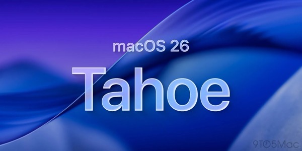
I wrote a bit earlier about some of my early thoughts on the new OS 26 releases and here’s a few more to share about macOS 26 Tahoe. I continually beat a drum about the fact that we’re all on Apple’s beta bus, whether we opt in to receiving betas or not. I don’t opt in. Several of these thoughts keep that percussive refrain rumbling along through the issues below.

MacOS 26 Tahoe purple.

Memory Leaks

Since the release of macOS Tahoe 26.0.1 I’ve seen strange memory leaks increasing for what I think are odd reasons. For example, a process known as IconServicesAgent increases the longer I go between rebooting sessions. According to documentation I’ve found online, one of the causes of this can be an overly large or corrupted icon cache, or specific icon causing the problem. A solution is to clear the icon cache, which I’ve done, but the problem reoccurs.

I don’t have the expertise or the patience to tray and track down which icon(s) may be the issue, so hopefully this gets fixed in an upcoming release.

CleanShot 2025-10-17 at 09.35.13@2x.

My hunch is this has to do with icons being a lower priority for developers who still have a lot of other work to do on their apps. I base that on the number of non Apple app icons I see that haven’t been updated for Liquid Glass.

Notifications Memory Leak

There’s another memory leak that I see less frequently and seems a bit more random. You can see in the image above the amount of memory NotifcationsCenter is consuming. Apparently this “occurs when a program holds onto references to objects, like activities or other resources, even after they are no longer needed, and uses the notification system as a way to do so.”  It’s tough to pin down whether these memory leaks are the fault of developers hindered by Apple’s choices, or just a system bug. Either way it’s far from optimal.

Again, I don’t have the expertise to sort this out, so I’m hoping for a fix in an update down the road.

Notification Summaries

Prior to macOS 26 Tahoe I had long ago turned off Apple Intelligence’s Notification Summaries on macOS Sequoia. I turned them back on with this new release to see if things improved. They did not. In my experience they are just as bad and just as useless as they were previously. So I’ve turned them off again.

Liquid Glass, Corners, and Such

I find the general acceptance that Apple made Liquid Glass less of a priority than it did on other device platforms amusing because it’s not only true, it’s true in the way a red wine stain shows up on a white shirt or blouse. That said, the somewhat half-way approach we do have, while not a deal breaker, is becoming increasingly more visually annoying.

CleanShot 2025-10-17 at 16.19.10@2x.

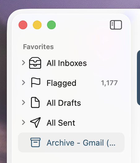
The lack of contrast for Sidebars always jerks my attention away when I have a sidebar open because for someone who once had real vision issues due to cataracts, it triggers a flashback to when I first started noticing those since corrected eye issues. The screen shot above makes it look like there is greater contrast than what I see in actual practice.

I’m also just not buying the entire concept of bringing “more focus to content.” Again, it’s more distracting than focusing. The more I see it the more distracting it becomes, which I’m guessing is antithetical to what Apple’s designers were hoping. This is true on iPhones and iPads as well.

CleanShot 2025-10-17 at 16.20.14@2x.

Widgets

This is one instance when the drum beat of bad beta behavior sounds loudest. Again, I do not run betas on any of my devices. Yet, each time that Apple releases a beta for the next version of macOS 26 all of the widgets I use on a secondary screen will disappear the morning before the release. I can set my clock by it. I’ll go to the trouble of restoring them. Within the next day or so duplicates of those widgets will appear, but strangely now revealed under Notifications.

CleanShot 2025-10-17 at 13.11.28@2x.

At first I deleted the duplicates but after this week’s beta release I noticed that they eventually disappeared on their own. It’s odd behavior to say the least.

Control Center

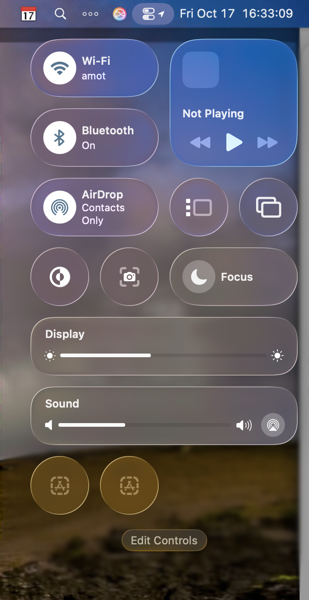
Speaking of Control Center, Apple is obviously hoping to move a lot of what functionality available in Menu Bar icons into the Mac Control Center. Apple has provided an API for developers to make that possible so that user can access those functions from the Control Center instead of the Menu Bar. I have very few apps that have taken advantage of this so far, again speaking to the slow pace of adoption by developers with other priorities.

CleanShot 2025-10-17 at 16.33.03@2x.

Even so, the two I have placed in the Control Center are sometimes present and sometimes not. To my surprise they appeared this morning. Not surprisingly they do not appear this afternoon, merely showing a place holder.

Control Center Notifications

Apple moved Notifications for things like Bluetooth and WiFi connections, volume sliders, and other functions so they animate out of the Control Center. That means they pop out in the upper right hand corner of the screen. That said, I find when they do animate they either distract me from what I’m doing, since I’m typically looking at the center of the screen, or my muscle memory of looking for them in different locations causes me to miss them entirely.

CleanShot 2025-10-17 at 16.39.54@2x.

The beta drumbeat pounds on

It’s been obvious since the release of macOS 26 Tahoe that Apple has a lot of work still to do. Some of that obviously was by design due to time and resources. Fine, but not fine. You can’t expect high performance out of a F1 race car unless your pit crew can nail the basics. As it currently stands Apple has its shiny new car well polished for pictures and demos, but is obviously still behind with its own engineering, throwing more delays at developers in the pit, in turn leaving users wondering about the turns ahead.

I frankly don’t see these gaps closing until sometime next spring at this point. Just in time for Apple to begin shifting resources to whatever comes next. I find that sloppy, unsettling, and like a lot of things Apple-like, not very Apple-like these days.

You can also find more of my writings on a variety of topics on Medium at this link, including in the publications Ellemeno and Rome. I can also be found on social media under my name as above.

Stop Snoozing and Wake Up: Apple Changes Alarm Shutoff Screen

If you snooze, you lose

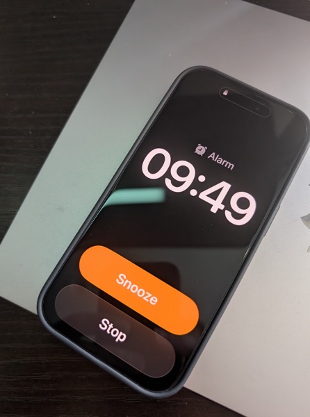
It was a real wake up call for me when news broke recently that in the next major update to iOS 26 Apple will be changing the wake up screen for alarms. The change means that instead of having two buttons, one above the other to either Snooze the alarm or Stop the alarm, users will now have to Slide a button to turn off the alarm.

PXL 20251013 144935012.

This shouldn’t have been that much of a surprise for me as prior to iOS 26, the snooze button was a big orange one and the “button” to turn off the alarm was below it and much smaller. I can’t tell you the number of times I, and my wife, accidentally hit the snooze button instead of turning off the alarm.

To my tastes, Apple fixed that in the initial release of iOS 26 by making the buttons of similar size, even if the Snooze button still grabbed all the glory and color.

Here’s the thing. Of course how you wake it up is a very personal preference. Personally, I’m not a snoozer. When it’s time to wake I want to wake up and get moving. But apparently the majority of the world prefers snoozing, as do the folks making decisions in Cupertino. When you think about it explains quite a bit about so much when it comes to meeting the challenges of each day, whether in the real world or in tech.

What’s that old saying, if you snooze, you lose? I think that’s it.

I can only imagine how many iPhones are going to be knocked off of bedside tables as semi-awake users attempt to slide the button to silence an alarm. If I was responsible for the design, I’d have made it more challenging to hit a snooze button than to hit the wake up button.

But that’s just me.

You can also find more of my writings on a variety of topics on Medium at this link, including in the publications Ellemeno and Rome. I can also be found on social media under my name as above.

iPhone and OS 26 Reviews Off The Beaten Track

Looking for some new voices.

New iPhones have been released, are being delivered, and I assume being used. Some of the usual sources have already reviewed the devices and the new operating systems and I’m guessing you’ve seen many of those.

Insider explains who the iPhone 17 Air is for.

I’m enjoying reading reviews that are sort of off of the beaten track, assuming the Internet has one of those, and thought I’d link to a few of them.

First up Jason McFadden of Jason Journals talks about his experiences and impressions after installing OS 26 on several older devices. Good read.

Next up is Sebastian de With’s look at the iPhone 17 Pro cameras. Sebastian is one of the developers of the team Lux that developed the Halide camera app for the iPhone.

Olivia Lipski writing for Good HouseKeeping says I’m a Tech Reporter and a Mom. Here’s My Honest Review of the iPhone Air.

And finally Rakhim Davlekali has written a review of macOS in reverse starting with the now current Tahoe and going backwards through time. Benjamin Button Reviews macOS is worth a read for a few laughs.

I still think it’s early for any real judgements to be made about the new devices and new operating systems. But the links above are worth a look.

You can also find more of my writings on a variety of topics on Medium at this link, including in the publications Ellemeno and Rome. I can also be found on social media under my name as above.

OS 26 First Impressions

Early thoughts on OS 26 versions

Bubbles. My grandkids love bubbles. It’s a kid’s delight. Apparently bubbles also delight some Apple designers. My first impression of the look of iOS 26 on the iPhone was bubbles.

PXL 20250916 124836790.

I watched the OS 26 round of operating system betas over the summer as things evolved and have now installed the first release on all my devices. I’ve seen and heard the reactions so I was reasonably prepared for what would happen once the updates occurred. These are some first impressions after taking a look.

Liquid Glass

I’m not putting down bubbles. Bubbles are fun, whimsical, and joyful. But my overwhelming impression on the iPhone 16 Pro with iOS 26 installed was that the Liquid Glass design language, (that supposedly isn’t a design language,) felt very bubbly and child-like. To my eye I associate it more with bubbles than I do glass, liquid or not.

I also thinks Liquid Glass looks and feels better on the iPad Pro than it does on the iPhone. There’s more space for the chunkier, bubblier UI elements to float around. By and large things look cleaner on the iPad.

On the Mac, Apple didn’t go quite as far with Liquid Glass as they did with the iPhone and iPad regarding transparency and bubbly things, but there is still a more cartoonish feel to macOS 26 than the previous version. I think most of that is due to the rounded corners, rounded buttons and tab bars. I will say in this early going, I miss what I felt was a cleaner design in Sequoia on the Mac than what I see in this early going with Tahoe.

Bubbles are also messy things. Messier than glass in solid form certainly. Perhaps applying liquid properties to this glass like interface provides a license to keep things messier. That’s certainly true in some cases on the iPhone. For example, in the Phone app the reflective (or is it refractive) qualities around the buttons make it feel like light is leaking through a misapplied sticker than I think was the intent.

New Shareshot.

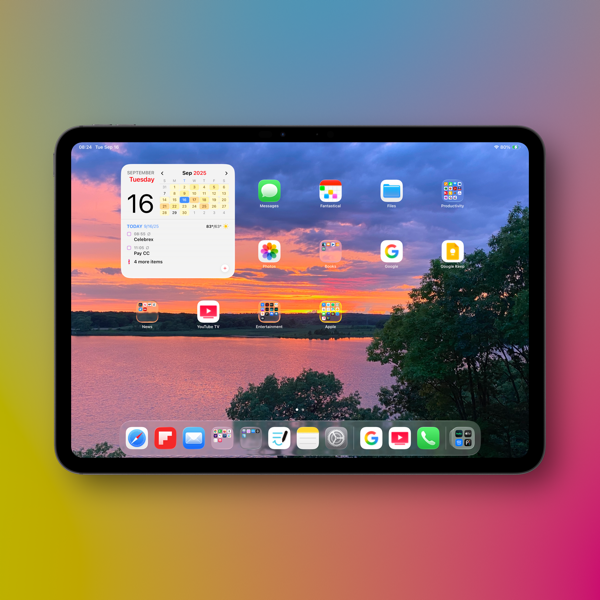
On both the iPad and the iPhone you’ll have to be careful what you choose for a wallpaper, because that same light leaking through means photos that have many colors or light contrasts within them appear more distracting than pleasing. (I like to use my own photography for wallpapers).

New Shareshot.

The issues of legibility have been discussed quite a bit over the summer, and I don’t think Apple has a complete solution for that yet when it comes to complex backgrounds, other than seemingly to force users to make simpler choices with wallpaper backgrounds. In early use, I think what we see on iPhone and iPad completely renders useless the statement of letting your content shine through. It might bleed through, but if it shines it does so in a distracting manner.

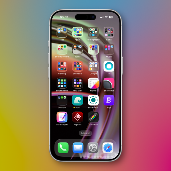
Here’s an example of one of my Home Screens that I think makes things look more bubbly than Liquid Glassy, especially in the upper two rows of folder icons.

New Shareshot.

Alan Dye, the VP of Human Interface Design, the Apple guy who spearheaded this UI change, is quoted as saying that Liquid Glass is “the foundation for new experiences in the future.” All well and good when you have a fuller view of the future as one assumes he would. But for those looking at their devices today, that means as much or as little as any tech promise or vision that have been dropped on us these last few years.

Liquid Design, in my very early looks is not to my taste. It may be to yours. the good news is that everything still appears to be functional. But to me, it’s a child-like appliqué on sophisticated devices that seem to beg for something more mature. I’m sure Liquid Glass will evolve, but until it does, I don’t think these bubbles will be popping soon.

Other Changes

I haven’t explored many of the new features of any of these new operating systems, only attempting to get things up and running. Most things appear to be running well.

A few changes I like include:

I prefer this iteration of the Photos app in iOS

I like the big multi-tasking changes for iPad and look forward to working with them more, although count me as one who will miss Slide Over. It was handy in my work in rehearsals.

I like the new Trash Can icon on the Mac. That’s the kind of whimsy I can support.

CleanShot 2025-09-16 at 07.18.24@2x.

I love the wrist flick gesture on the Apple Watch.

Things I’m not a fan of:

On the Mac I miss the Shortcuts item in the menu bar. Yes, you can add one, but instead of getting a straight drop down of clickable Shortcuts, it now opens a new window that requires not only the selection of the Shortcut you want to execute, but another separate action to run the Shortcut. Adding clicks isn’t much of a shortcut to me.  I see where Apple is going with this, trying to move things out of the Menu Bar into the Control Center. That’s going to require developers to make that move successful.

CleanShot 2025-09-16 at 10.04.19@2x.

I’m not a fan of some of Apple’s redesigned icons.

I tried out the Tinting feature for icons. I could see myself using this, if the feature didn’t tint widgets. What’s the point of a tinted Photos widget?

New Shareshot.

Some things I’m on the fence about:

I’ve previously used independent apps Bartender and Ice to control the large number of Menu Bar icons I like to have available. Both are currently in beta so I’m testing out Apple’s  feature to hide the Menu Bar until things change on those fronts. Simply put, that means the Menu Bar disappears until I hover over or click on it, revealing the icons. In using this feature when windows are at the top of the screen, Menu Commands sometimes disappear requiring some window rearrangement. This doesn’t happen consistently, so I’m guessing it’s a bug. I’m not sold on this in the early going but I’m giving it a try.

I’ve been using Raycast as an application and Shortcut launcher, along with some of its other features. I’m giving Apple’s new Spotlight features a try including the long overdue Clipboard Manager. This will require some muscle memory retraining, and it might mean leaving Raycast behind. It would be easier to do so if that Clipboard Manager copied across devices.

It’s early going. For me, as well as these new operating systems. I’ll discover more as I go along. I’m hoping the evolutionary pace for this software from Apple and most certainly developers will come close to matching mine in the days to come. I’m guessing it’s going to be sometime in 2026 before we can really evaluate what’s what in these OS 25 releases.

You can also find more of my writings on a variety of topics on Medium at this link, including in the publications Ellemeno and Rome. I can also be found on social media under my name as above.