
It’s been interesting to watch coverage of the new iPhone Duo. Regardless of how you feel about the device it is certainly something different and I dare say exciting to talk about.
 I haven’t seen or fondled the device in person as of yet. I’m planning a trip to a local Apple Store at some point early this week to see and touch it for myself. I’m sure my reactions will be similar to most. It’s a cool new piece of tech that has some first generation issues.
Regardless of how that visit pans out, I still don’t think the device is something I’m interested in. Perhaps in a future evolution. Perhaps one that is a folding iPad mini without all of the phone guts. I’d find that appealing. I’m guessing we’re at least a couple of years off from Apple and the carriers finding a way to make the Handoff feature, that seems obviously designed to attract folks who might want to own both a traditional slab phone and a folding phone, work as smoothly as Apple wants it to be. I certainly don’t want to pay for another phone line even as an add-on.
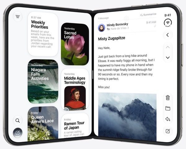
One thing I’ve noticed in reading and watching reviews is the right margin separation that Apple has segregated for the dock and controls, which I believe is the case in most orientations. I have seen images of some apps that also have controls on the left side when the device is open and showing two apps side-by-side. But that’s certainly not the case on the closed front screen. Even so, those I’ve seen seem to adhere to that separate toolbar (for lack of a better descriptor) approach. Apple chalks this up to a lack of vertical display space requiring these controls being located on the margins.
When I look at it and hear complaints from others about how that leads to wasted space, it makes me wonder why the choice. Certainly in the context of what the original promise of Liquid Glass was all about. It just seems natural to me that any of those controls could overlay content in a liquidly-glassy sort of way. I’m not saying that would be ideal, but to my eye it sure seems logical.
I could be off base completely and there may be some tech or design reason I’m not understanding. Although I do note that there is talk (rumors?) that Apple is working on ways to make Safari feel less cramped, and give developers more freedom in designing their apps.
There’s an interesting article by Lavande that relates to this that might be worth your time if your’e as curious or clueless as I am.
The only thing I’m sure of is whatever the second generation of the iPhone Duo turns out to be, I bet we’re in for some changes given the excitement around the new device and both the positive and negative feedback Apple has received so far.
Thanks for reading. You can subscribe to this blog if you care to. You can also find more of my writings on a variety of topics on Medium at this link, including in the publications Ellemeno and Rome. I can also be found on social media under my name as above. This site does not use affilate links.


